|
One of the key elements of successful design is balance.
There are two styles of balance.
1. Symmetry
2. Asymmetry
First, lets talk about symmetry.
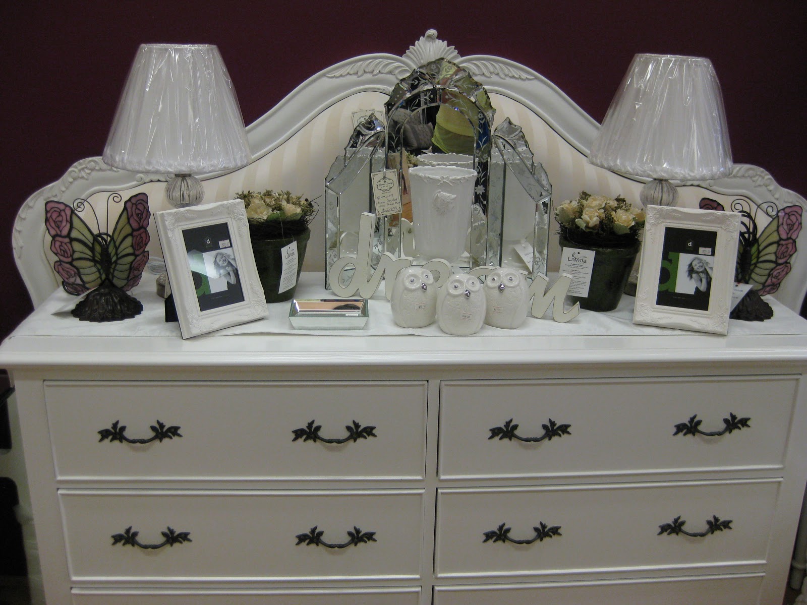
This is where visual balance is achieved by both sides being a mirror image of each other. A pair of candlesticks on either side of a dining table or a topiary plant on either side of a sideboard is a classic example of symmetry.
 |
| Hello symmetry |
Symmetry tends to have the following characteristics:
Formality
Quiet
Calm
Orderliness
Its downside is that it can be predictable and monotonous.
 |
| Serious symmetry here - even the 3 triangular stools under the table conform to the plan. |
 |
| This room has such strong symmetrical elements that you almost miss the asymmetry of the items on the coffee table and the large black vase on the left of the room. Note the round mirror also helps to soften a symmetrical room such as this one. |

 |
| Sometimes the symmetry isnt precise, however both sides have equal visual weight despite the forms not being identical. |
 |
| Note the items on the coffee table and the mantle - they are not symmetrical/identical pieces, however they balance each other out in terms of their visual weight. The effect is the balance of symmetry. |
 |
| Here symmetry is achieved with two different armoires on either side of the fireplace. Notice how it is less formal than if the room had identical armoires on each side. |
 |
| This one is interesting. The vase balances the lamp - they are of the same size and they frame the artwork. The effect is symmetry. |
Now lets look at asymmetry.
Asymmetry tends to have the following characteristics:
Movement
Vibrancy
Excitement
& Less formality than symmetry
 |
| The large picture on the right is balanced by a greater number of smaller frames on the left. It's asymmetrical but it's balanced. It works. |
 |
| Artwork with a vase on either side is very predictable. Here, there single large vase is balanced by the artwork. It's asymmetrical but it works. |
|
| The three vases are heavier than the glass bowl with the balls. However balance is achieved with the white stool which counterbalances the white vases. |
Most people aim for balance when
decorating their homes –
they don’t want rooms to appear like they are tilting
because
all the “heavy” stuff is on one side. That is, they want to
create spaces that are in balance.
Here are some "rules" about creating balance:
1. Larger items (like chests or an
armoire) appear visually
heavy – balance can be achieved by also having something
equally large or by a placing a few smaller items against the
large piece.
2. Bright,
dark or warm colors look heavier than cool, lighter
and greyed colors.
3. Striking
patterns and textures draw the eye’s attention
more than smoother, plain
pieces.
4. Items
placed above eye level appear heavier than those
placed lower.
5. Brightly
lit areas attract more attention (ie: have greater
visual
weight) than dim corners.
TIP: Anything
that draws attention or focus can be
considered “heavy” because your eye
constantly returns
to it.
Light colors, transparent elements, small, plain
elements
all have little or no visual weight and would not be good
counterpoints to a large armoire or dark colored sofa.
Everytime we sell an item in the store, we have to consider how to re-decorate to the space looks balanced again. This can be fun and it can also be painful.
Today, we had a balance incident in the store. A cabinet left for a new home and a lamp that was placed on it had to find a new position in the store. The lamp seemed to fit on a column (which was bare as a result of a floral arrangement being sold). Problem was the blingy artwork (mushroom & black) behind the column was fighting with the lamp.
So we stepped back & rotated the blingy artwork 90 degrees. All of a sudden the distance between the bling and the lamp worked.
But the bling wasnt a symmetrical piece.
Here is a photo of the bling as we originally placed it (left) and rotated 180 degrees (right).
Which looks better?
 |
| Option #1 Option #2 |
Option #1 looks better. Why?
In Option #1 the dark bling colour balances out the dark lamp shade. Option #2 has too much dark on its left side and this is accentuated even more with the dark framing board which is also on the left side.
Effectively, option #1 throws some of the black to the right side and hence creates a more balanced (ie: pleasing) look.
What can you do?
French style decorating is traditionally quite formal. Hence symmetry tends to prevail. You may also find yourself gravitating to symmetry.
On the other hand, maybe you gravitate toward a more casual mismatched look? That way you can avoid having to buy doubles of everything!
Interestingly, at Glamour Living some of our staff are symmetry nuts and some are not, So we can give clients both perspectives.
But whatever you tend to do, we encourage you to try something different.